I love data visualisation, in fact I was given a wonderful book entitled “Information is Beautiful” by David McCandleless as a present a few days ago… anyway I just stumbled across this on Mashable
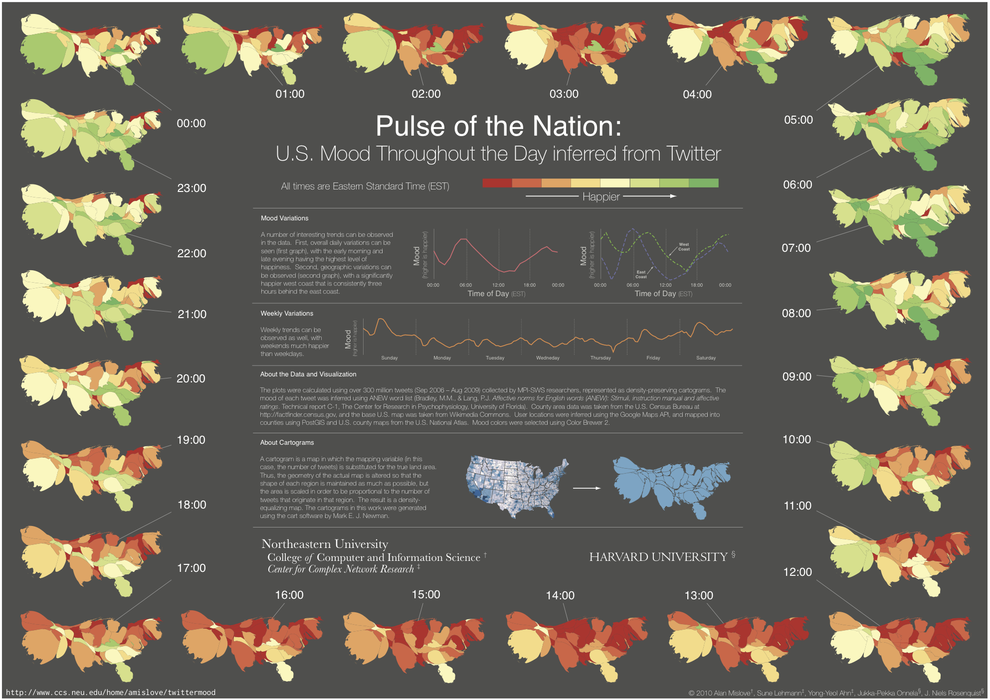
The video shows the mood in the U.S., as inferred using over 300 million tweets, over the course of the day. The maps are represented using density-preserving cartograms more info here