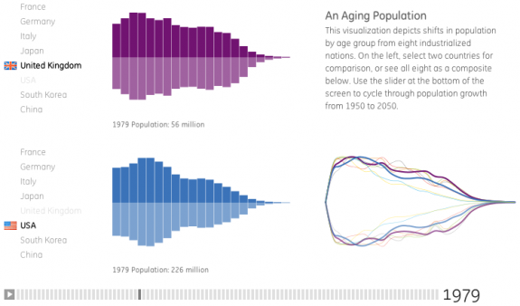
You may have worked out by now that I’m a statistics and infographics junkie… so here is a brilliantly executed interactive infographic that highlights the predicted age by percentage of various nations… as you will see, Japan, South Korea and Italy will have a very different looking population by 2050, compared to today
you should follow me on twitter here
